White Paint Colors That Designers Swear By
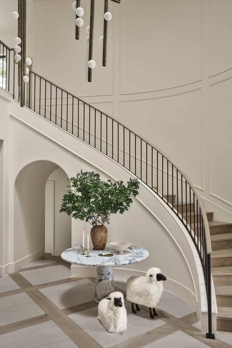
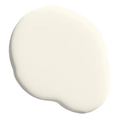
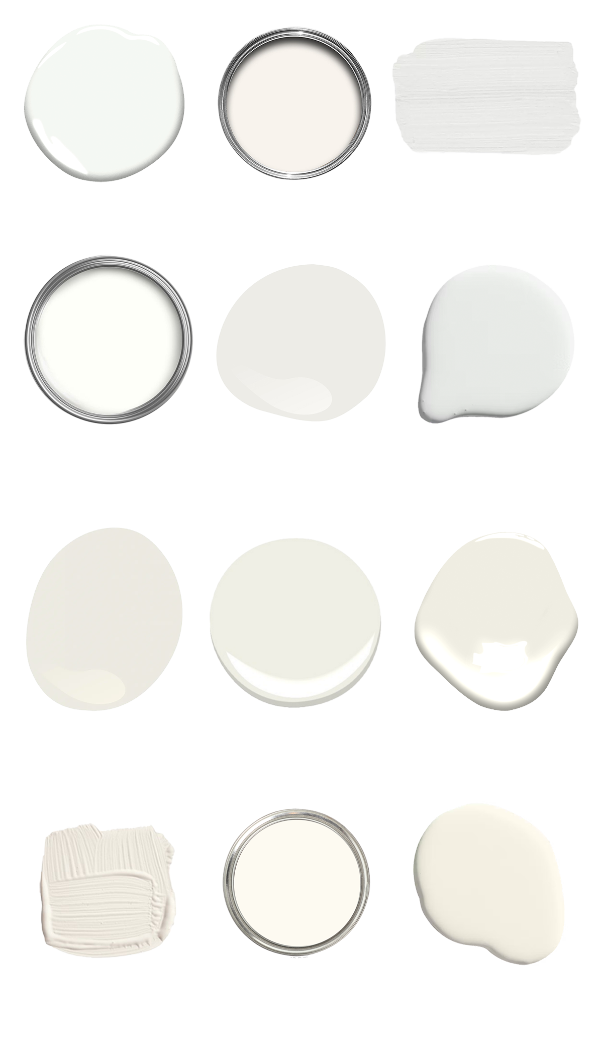
White paint is a staple in the design world, providing a versatile backdrop that can make any space feel fresh and inviting. However, not all whites are created equal. There are cool whites, warm whites, and everything in between, each offering a unique character and mood to a room. Here are twelve white paint colors that we love and designers swear by, along with tips on how to use them in your home or commercial space.
Cool Whites
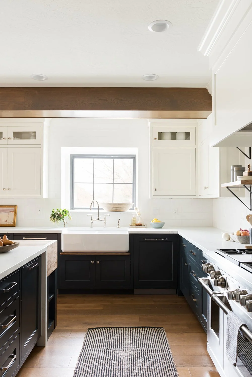
1. Benjamin Moore – Chantilly Lace (OC-65)
COOL WHITE
Chantilly Lace is one of the brightest and purest whites in the Benjamin Moore collection. It has minimal undertones, making it a crisp, clean white that works beautifully in spaces where a modern or sleek aesthetic is desired.
Application: Chantilly Lace excels in contemporary spaces. It’s perfect for bright, open-concept areas like kitchens or dining rooms, where its cool brightness enhances natural light. For commercial applications, it works beautifully in showrooms or office spaces where a clean, polished look is needed. Pair it with black accents or bold artwork for a high-contrast, modern design.
Image: Studio McGee
Upper Cabinets: Benjamin Moore - Chantilly Lace
Walls: Benjamin Moore - Simply White
Lower Cabinets: Benjamin Moore - Midnight Blue
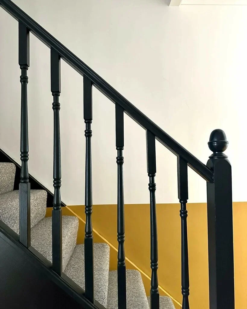
2. Farrow & Ball – All White (No. 2005)
COOL WHITE
All White is a pure, clean white with no additional pigments or undertones, making it an excellent choice for modern spaces. It provides a blank canvas that allows architectural details and furnishings to take center stage.
Application: Use All White in spaces with minimal decor, such as gallery walls or contemporary homes. It’s also ideal for high-traffic commercial spaces like retail stores or restaurants where you want a fresh, bright background that doesn’t distract from the overall design. In a minimalist home, pair it with concrete floors or metal finishes to emphasize its crisp quality.
Image: Farrow + Ball
Walls [Upper]: Farrow + Ball, All White, No. 2005
Walls [Lower]: Farrow + Ball, India Yellow, No. 66
Railing: Farrow + Ball, Railings, No. 31
3. Sherwin-Williams – Extra White (SW 7006)
COOL WHITE
Extra White is a bright, clean white with cool undertones that offer a sharp, polished look. This color amplifies natural light and is perfect for creating a modern, airy feel in both homes and commercial settings.
Application: Extra White is ideal for ceilings, trim, and moldings, making spaces feel larger and more open. It also works great in kitchens or bathrooms where you want a fresh, contemporary look. In commercial spaces like tech offices or modern retail shops, Extra White creates a sleek, cutting-edge atmosphere. Pair it with cool greys or metallic finishes for a cohesive design.
Image: Sherwin Williams
Walls: Sherwin Williams, Eider White, SW 7014
Wainscoting: Sherwin Williams, Extra White, SW 7006
4. Benjamin Moore – Simply White (OC-117)
COOL WHITE
Simply White is a bright, warm white with a hint of warmth that prevents it from feeling too cold. It’s a fantastic middle ground between stark cool whites and softer, creamier shades, making it incredibly versatile.
Application: This color is perfect for kitchens, bathrooms, and hallways, where you want a fresh and energizing feel but without the sharpness of a pure white. Simply White’s versatility also makes it great for commercial spaces such as cafés or offices, where you want a light, welcoming atmosphere that still feels clean and modern. Pair it with natural woods or vibrant textiles for added depth.
Image: Benjamin Moore
Walls: Benjamin Moore, Simply White, OC-117, Matte Finish
Trim: Benjamin Moore, Simply White, OC-117, Semi-Gloss Finish
5. Sherwin-Williams – Pure White (SW 7005)
COOL WHITE
Pure White offers a soft, neutral tone that has both warm and cool qualities, making it a flexible choice for many interiors. It leans slightly cool but without the starkness of a brighter white, making it a favorite for both residential and commercial spaces.
Application: Pure White is excellent for creating a balanced, neutral backdrop in any room. It works well on walls, trim, and ceilings, creating a cohesive look throughout a home. In a commercial setting, Pure White is great for professional spaces like law offices or coworking spaces, offering a clean, polished atmosphere. Pair it with soft greys or light blues for a calming, modern aesthetic.
Image: Studio Ten 25, Photography: Erin Konrath
Walls: Sherwin Williams, Pure White SW 7005
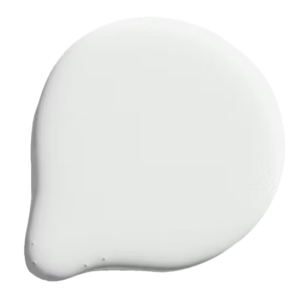
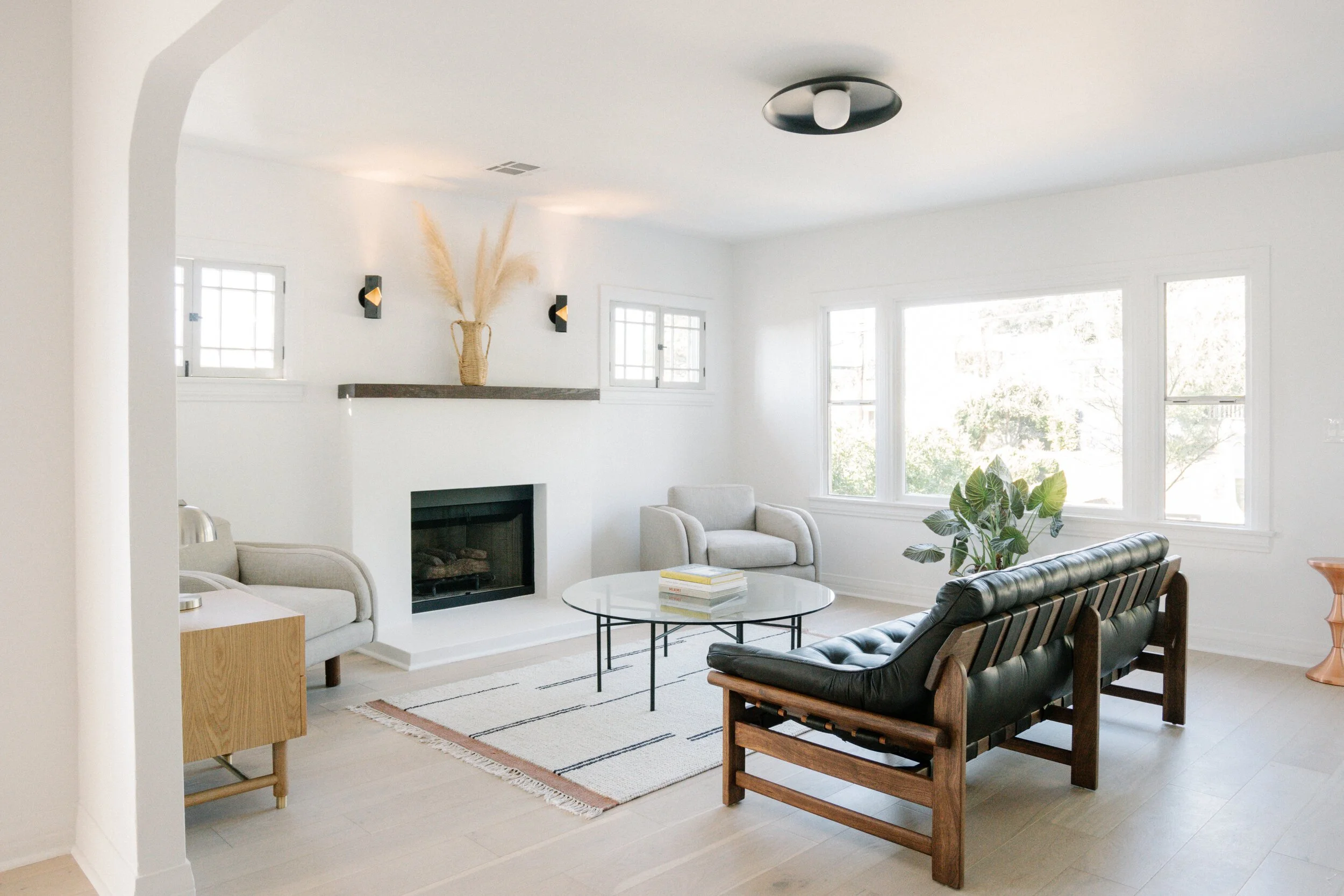
6. Backdrop – Cool Moon
COOL WHITE
Cool Moon is a soft, muted white with a cool undertone and a subtle hint of grey. It’s sophisticated and serene, making it perfect for modern spaces that call for a calm, cool ambiance.
Application: Cool Moon works beautifully in living rooms, open-concept spaces, or bedrooms where a calming atmosphere is desired. It’s also an excellent choice for commercial settings like minimalist offices or modern retail spaces, where a refined, understated look is key. Pair it with silver accents or deep blues for a serene, contemporary feel.
Image: Working Holiday Studio
Walls: Backdrop Home, Cool Moon
Warm Whites
7. Sherwin-Williams – Alabaster (SW 7008)
Warm White
Alabaster is a warm, creamy white that is beloved for its soft, timeless quality. It offers a touch of warmth without veering into yellow, providing a calming and serene backdrop for interiors. Alabaster feels grounded and soothing, which is why it’s so popular in both residential and commercial spaces.
Application: Alabaster works beautifully in spaces that need a relaxed, inviting feel, such as bedrooms, dining rooms, or living areas. It’s also a great choice for kitchen cabinets or bathrooms where you want a clean yet warm aesthetic. In commercial settings, Alabaster is often used in wellness centers, spas, or quiet office spaces, creating a serene environment for clients or employees. Its gentle warmth helps foster a sense of peace and tranquility, making it a perfect white for more intimate spaces.
Image: Davis Interiors
Walls: Sherwin Williams, Alabaster SW 7008
8. Benjamin Moore – White Dove (OC-17)
Warm White
White Dove is one of Benjamin Moore’s most popular warm whites, and for good reason. It has soft, creamy undertones without being too yellow, offering a perfect balance of warmth and brightness. White Dove creates a subtle, elegant glow, making it a favorite for both traditional and contemporary spaces.
Application: White Dove is incredibly versatile, ideal for walls, trim, or cabinetry. Its soft warmth makes it an excellent choice for living rooms, bedrooms, or open-concept spaces where you want to create an inviting and comfortable atmosphere. In commercial spaces, White Dove adds a touch of sophistication to reception areas or boutique shops, especially when paired with natural wood or neutral furnishings. Its ability to complement both cool and warm tones makes it a flexible option for many design styles.
Image: BZ Interiors, Photography Kiely Ramos
Walls: Benjamin Moore, White Dove OC-17
9. Benjamin Moore – Swiss Coffee (OC-45)
Warm White
Swiss Coffee is a soft, warm white with subtle, creamy undertones, making it a favorite among designers for creating a welcoming and soothing atmosphere. Unlike brighter whites, Swiss Coffee offers a gentle warmth without appearing too yellow or beige, allowing it to adapt to both traditional and modern interiors.
Application: Swiss Coffee is an excellent choice for living rooms and bedrooms, as it provides a cozy backdrop that complements various color schemes and furnishings. It works particularly well in spaces with natural light, enhancing the warm undertones while maintaining an overall sense of calm. In commercial settings, it’s perfect for boutique offices, retail spaces, or cafés, creating a relaxed, inviting environment for customers or clients. Its versatility also makes it ideal for entire homes, seamlessly blending between different rooms without clashing.
Image: Catherine Kwong, Photography: Matthew Millman
Walls: Benjamin Moore, Swiss Coffee OC-45
10. Farrow & Ball – Wimborne White (No. 239)
Warm White
Wimborne White is a timeless warm white with soft, golden undertones. While it reads as a true white, the warmth adds depth, making it a great option for those who want a clean look without the starkness of a cool white.
Application: This color works wonderfully in living rooms, where it adds warmth and comfort without overwhelming the space. It’s equally impressive in bedrooms, creating a cozy yet elegant environment. In commercial settings, Wimborne White is perfect for boutiques and office spaces that need a balance between modern and inviting. Pair it with natural wood tones or soft textiles for a cohesive look. Use this paint shade in a high gloss to achieve a chic, lacquered look without having to use real lacquer.
Image: Jaqui Seerman, Photography: Madeline Tolle
Walls: Farrow + Ball, Wimbourne White, No. 239
11. Dunn-Edwards – Whisper (DEW340)
Warm White
Whisper is a soft, cool white with the slightest hint of grey. This gives it a subtle, muted quality that feels crisp without being too stark. It has just enough warmth to keep it from feeling cold, but it’s still a perfect choice for spaces where you want a clean, modern look.
Application: Whisper is ideal for spaces that need a bright, but not overly sharp white. It works beautifully in bedrooms and living rooms, creating an airy, fresh vibe without feeling clinical. In homes with a lot of natural light, Whisper enhances the light, giving rooms a serene and tranquil feel. Often times, it is described as “soft and romantic”. It’s also a great option for modern kitchens and bathrooms, where it can be paired with stainless steel or cool-toned accents like grey or soft blues.
For commercial spaces, Whisper is perfect for offices, art galleries, or any environment where a neutral, sophisticated backdrop is essential. It allows the design elements, furniture, or artwork to shine while maintaining a polished and refined aesthetic. Pair Whisper with metallic accents or natural stone for a modern, upscale look.
Image: Dunn Edwards
Walls: Dunn Edwards, Whisper DEW340
12. Backdrop – Harvest Moon
Warm White
Harvest Moon is a creamy, warm white with a subtle golden undertone that immediately evoke warmth and comfort. Its richness makes it ideal for adding depth to spaces that need a soft touch without feeling too yellow.
Application: Harvest Moon is perfect for family rooms, dining areas, or kitchens where warmth is key to creating a welcoming vibe. In a commercial setting, it’s a fantastic option for restaurants, cafés, or wellness spaces, where warmth and relaxation are essential. Pair it with darker wood or brass accents to highlight its creamy undertones.
Image: @surroundedbycolor
Walls: Backdrop, Harvest Moon
Tips for Choosing the Right White
1. Consider Lighting: The amount and type of natural light a room receives can significantly impact how a white paint color looks. Test samples in different lighting conditions before making a decision.
2. Complement Existing Elements: Look at your existing furniture, flooring, and other decor elements. Choose a white that complements these elements rather than clashes with them.
3. Purpose of the Space: Think about the function of the room. Cool whites are great for modern, high-energy spaces, while warm whites are better for cozy, relaxing environments.
4. Sample and Test: Always sample a few different whites on your walls and observe them at different times of the day to see how they change with the light and any additional colors in the space.
By carefully selecting the right white paint, you can create a timeless look that enhances any space. Whether you’re designing a home or a commercial workspace, these ten white paint colors are sure to provide a beautiful, versatile backdrop for your design vision.


